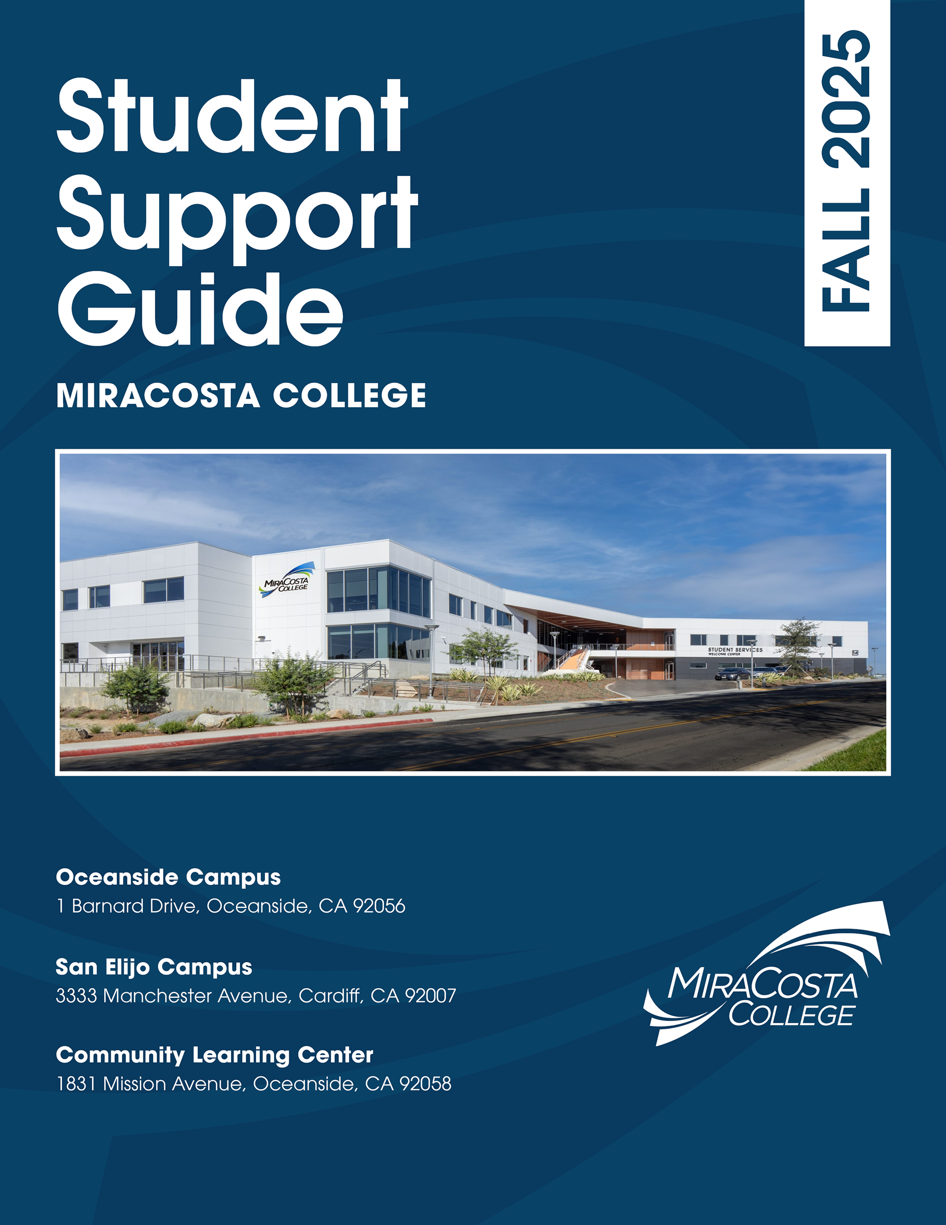
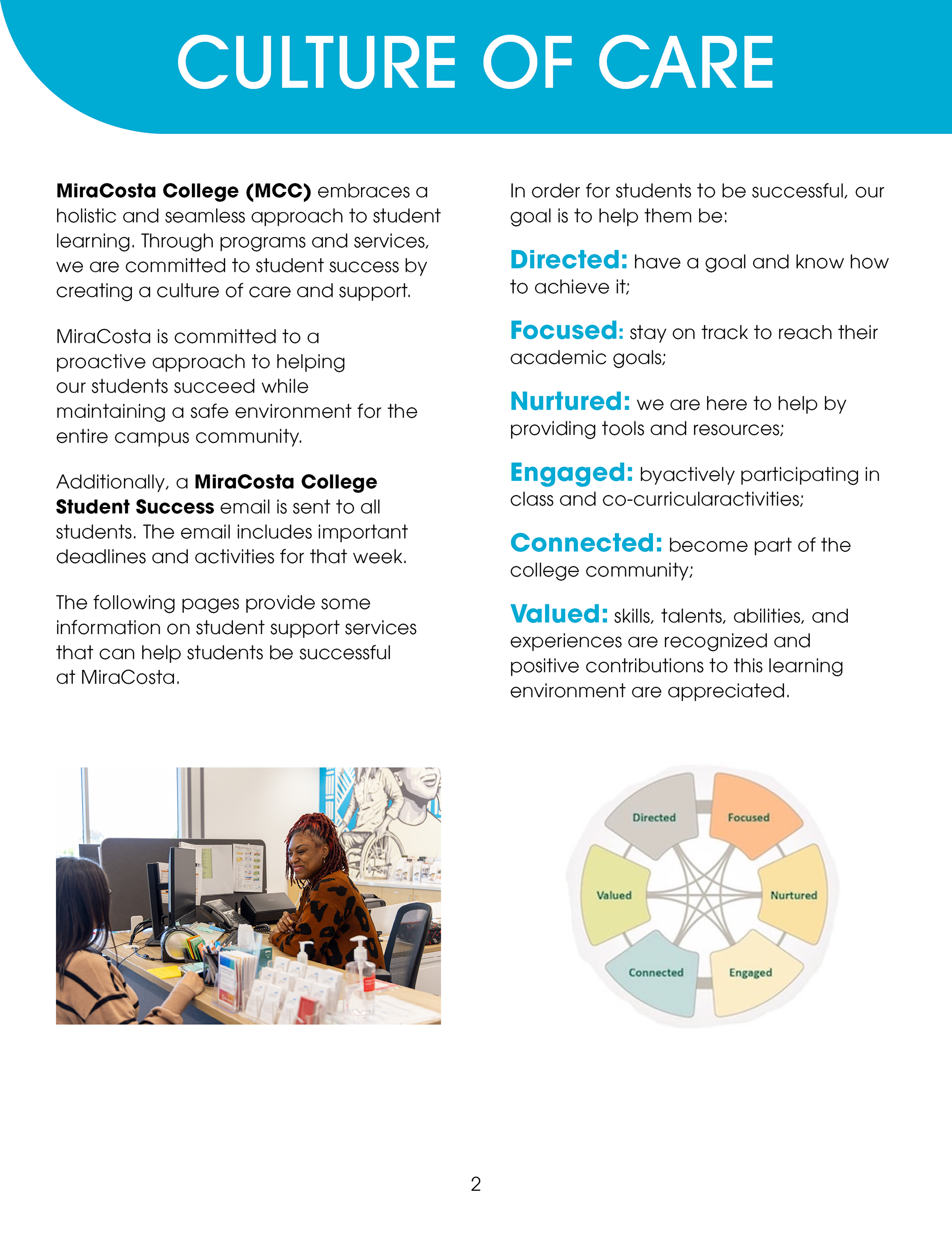
MiraCosta College’s Student Services Department approached our team with a straightforward request: to make their interactive services guide more legible. This guide, known as the Student Support Guide, serves as a digital introduction to MiraCosta College and an interactive glossary of every service it provides.
Layout design needed to be visually intuitive, accessible, and attractive. White space required distribution; images needed a standardized format and higher resolution. In short: we were to maintain the copy and single-page view format, but had freedom to do whatever we needed to make the reading experience positive.
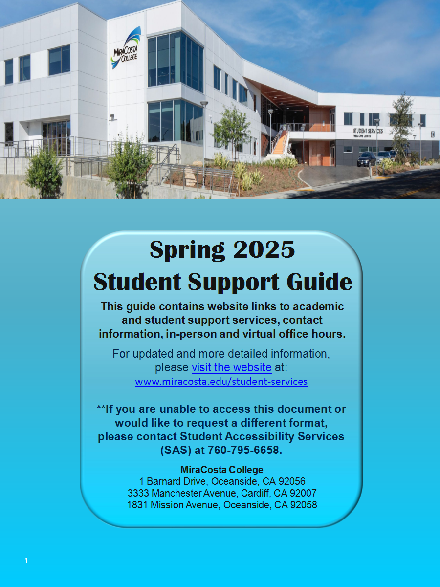
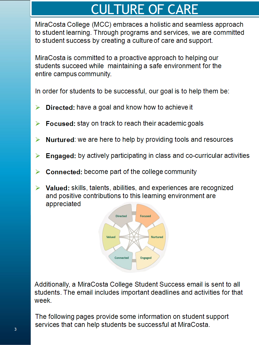
Before.
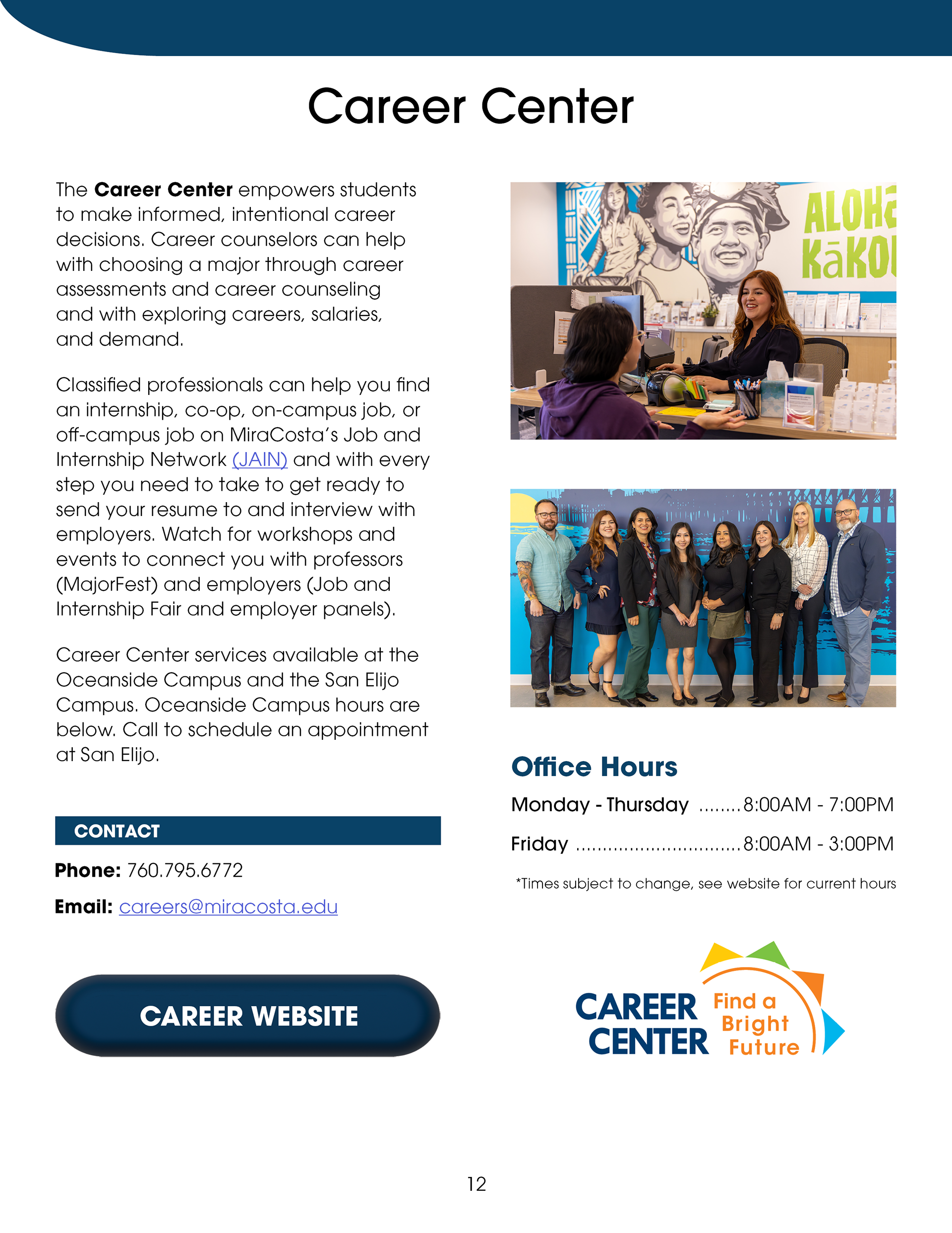
After.
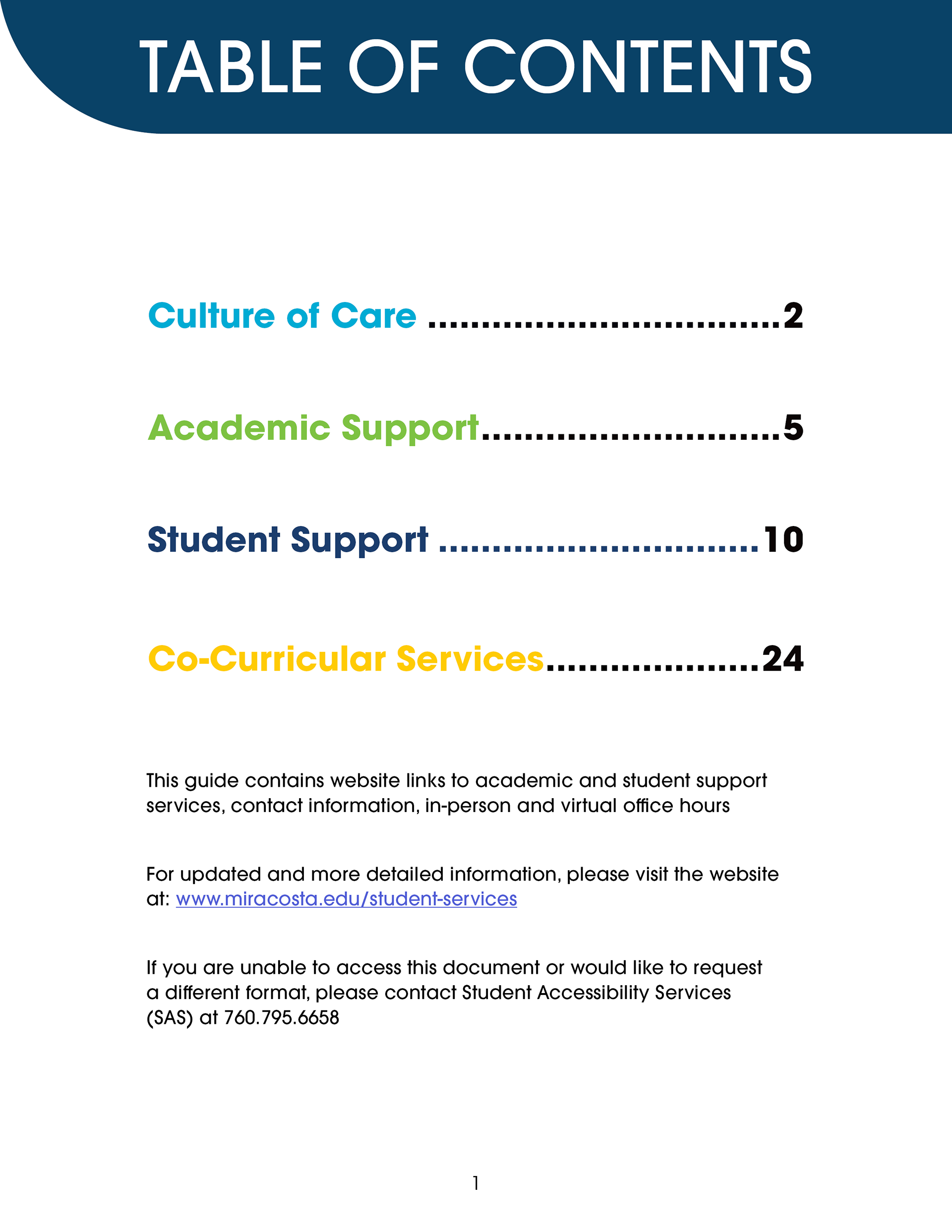
Our team took visual cues from MiraCosta College's branding guidelines. We reformatted the copy in ITC Avant Garde, the typography used for most of MiraCosta's documents. Several pages contained dense text that needed to be reflowed; then, based off this new page count, we updated the table of contents and color-coded it according to sectional themes.
Before (1)
After (1)
Before (2)

After (2)
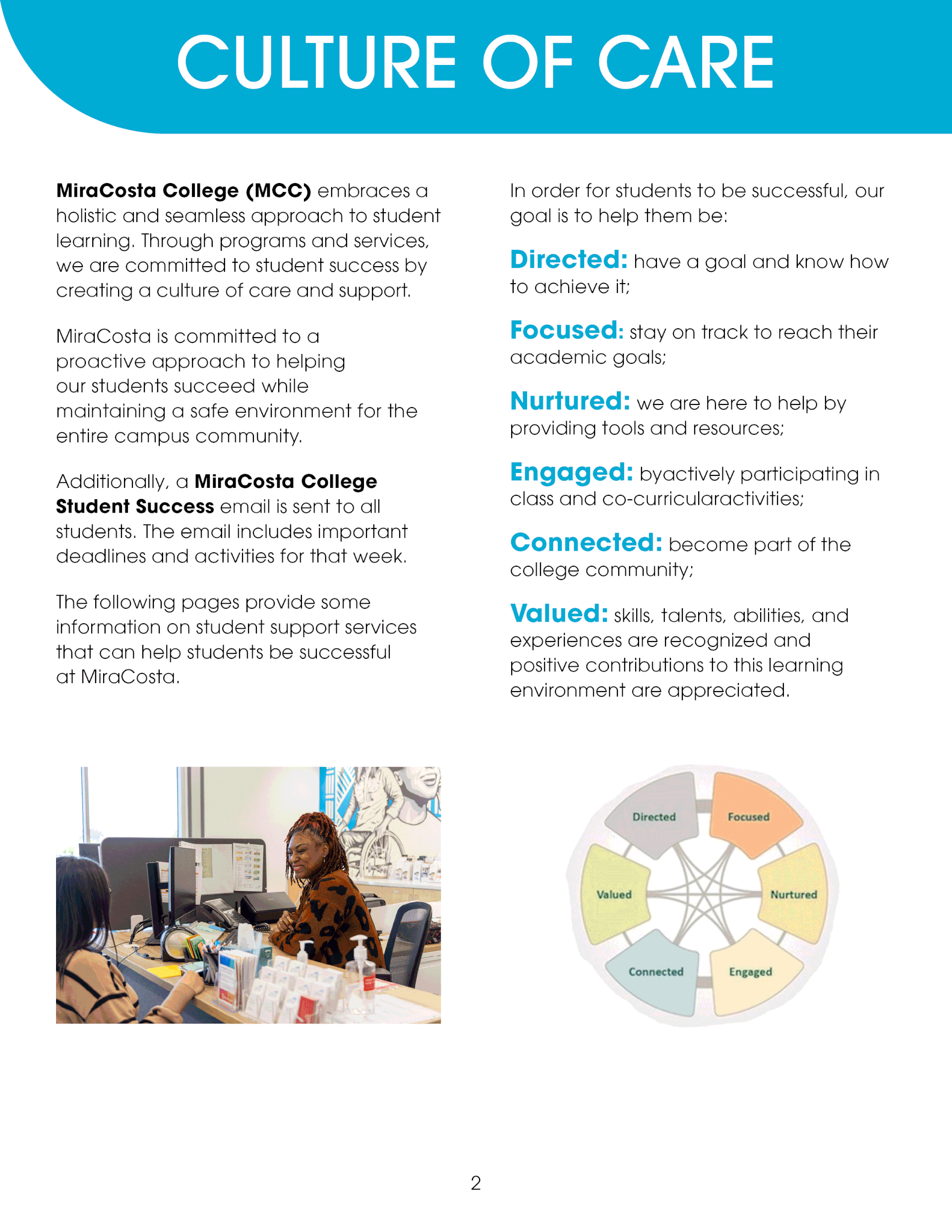
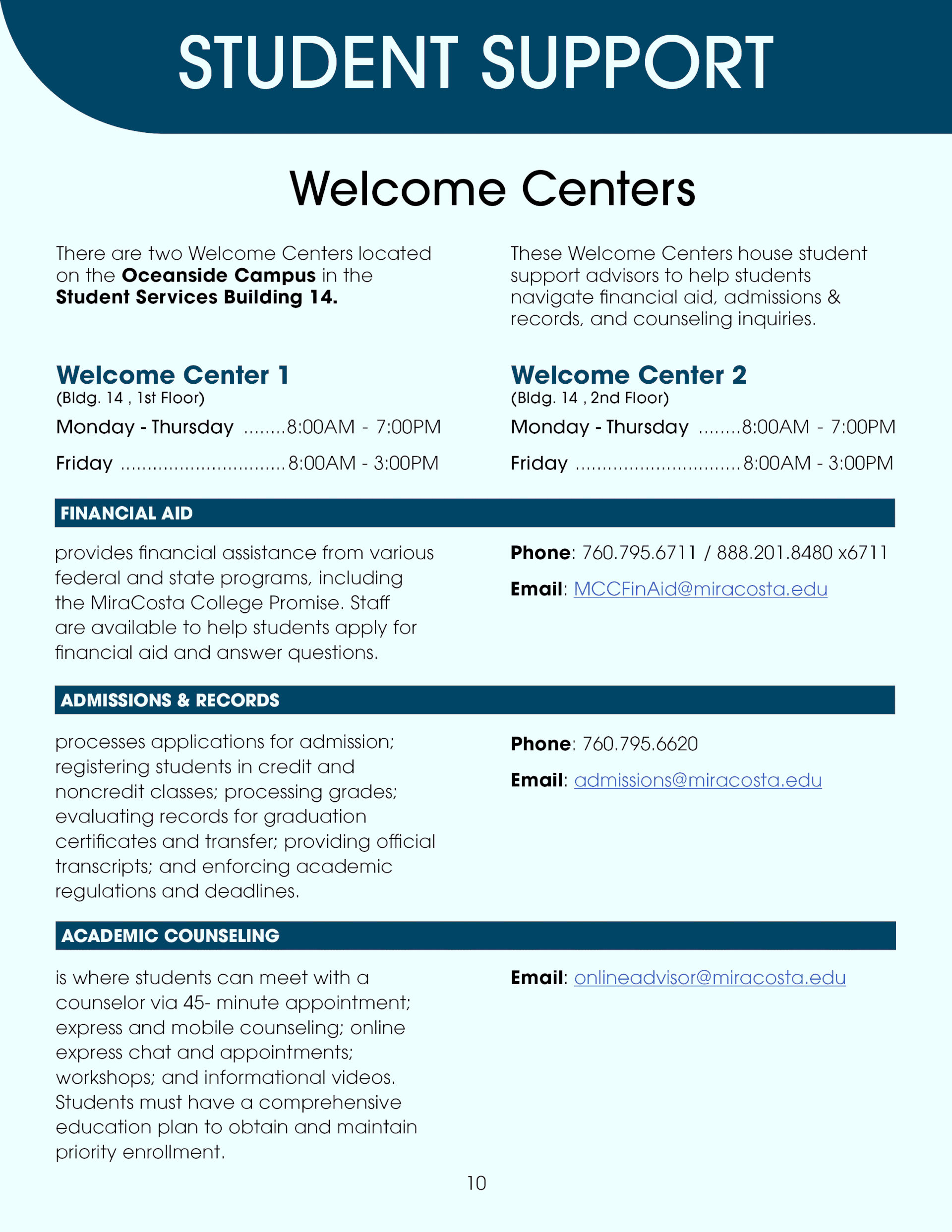
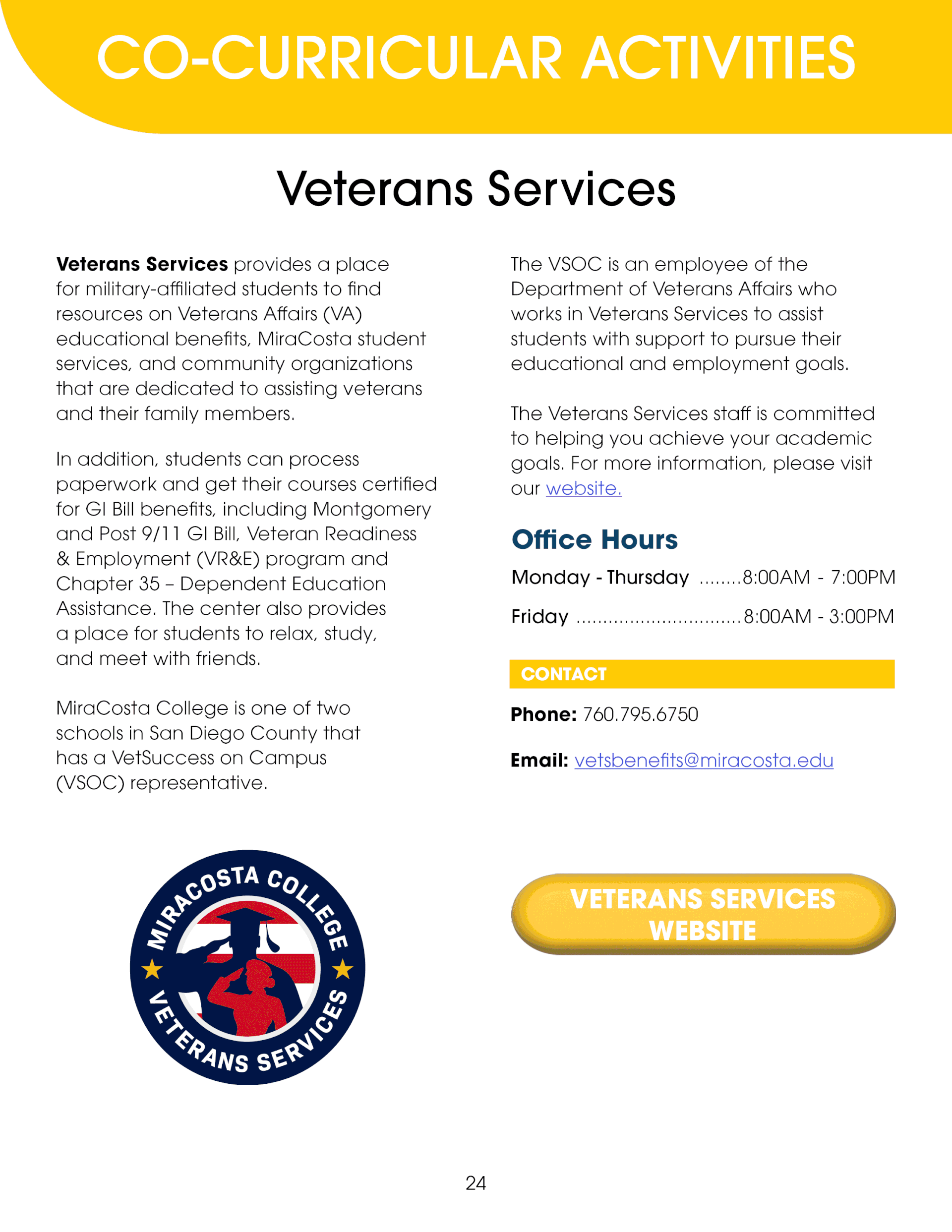
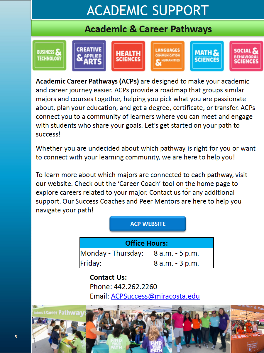
To maximize the space available on each page, we removed the blue gradient and shifted the content into a two-column layout. Charts were integrated without heavy linework to decrease visual clutter. Contact info was restructured into its own subsection, with its color paired to the section theme. Buttons also follow this theme and link directly to web sources.
Before.
After.
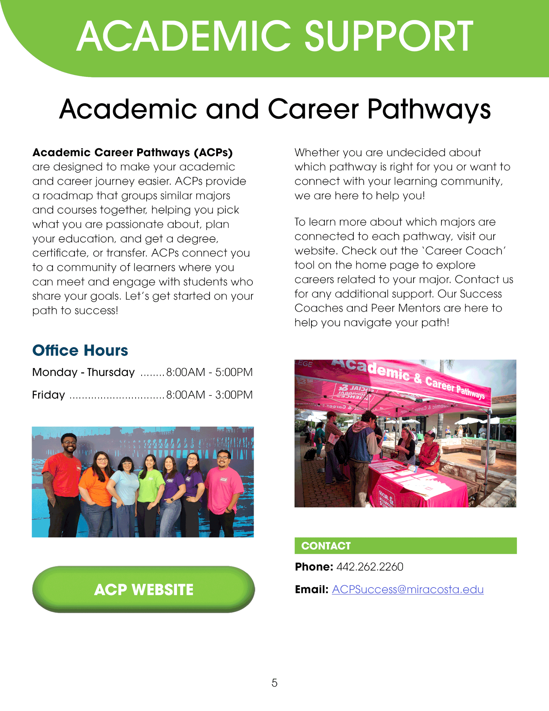
The client provided a photography database for our team to select from. New staff photos were also taken to provide visual continuity and a professional, unified front.
The result is a single-page view, interactive support guide structured to take information in hierarchical pieces punctuated with bright, school-spirit colors.