
The Goudy Type Specimen Brochure began as an educational project to develop typographic strategy and skill. Like early type specimens distributed through pamphlets, the goal was to assess a typeface and associated type family closely for unique attributes and potential applications. Beyond this, my goal was to obtain a greater appreciation for historic typefaces and typographers through an analysis of their cultural impact and process.
Arrangement of brochures, featuring Goudy's hand-drawn ornaments.

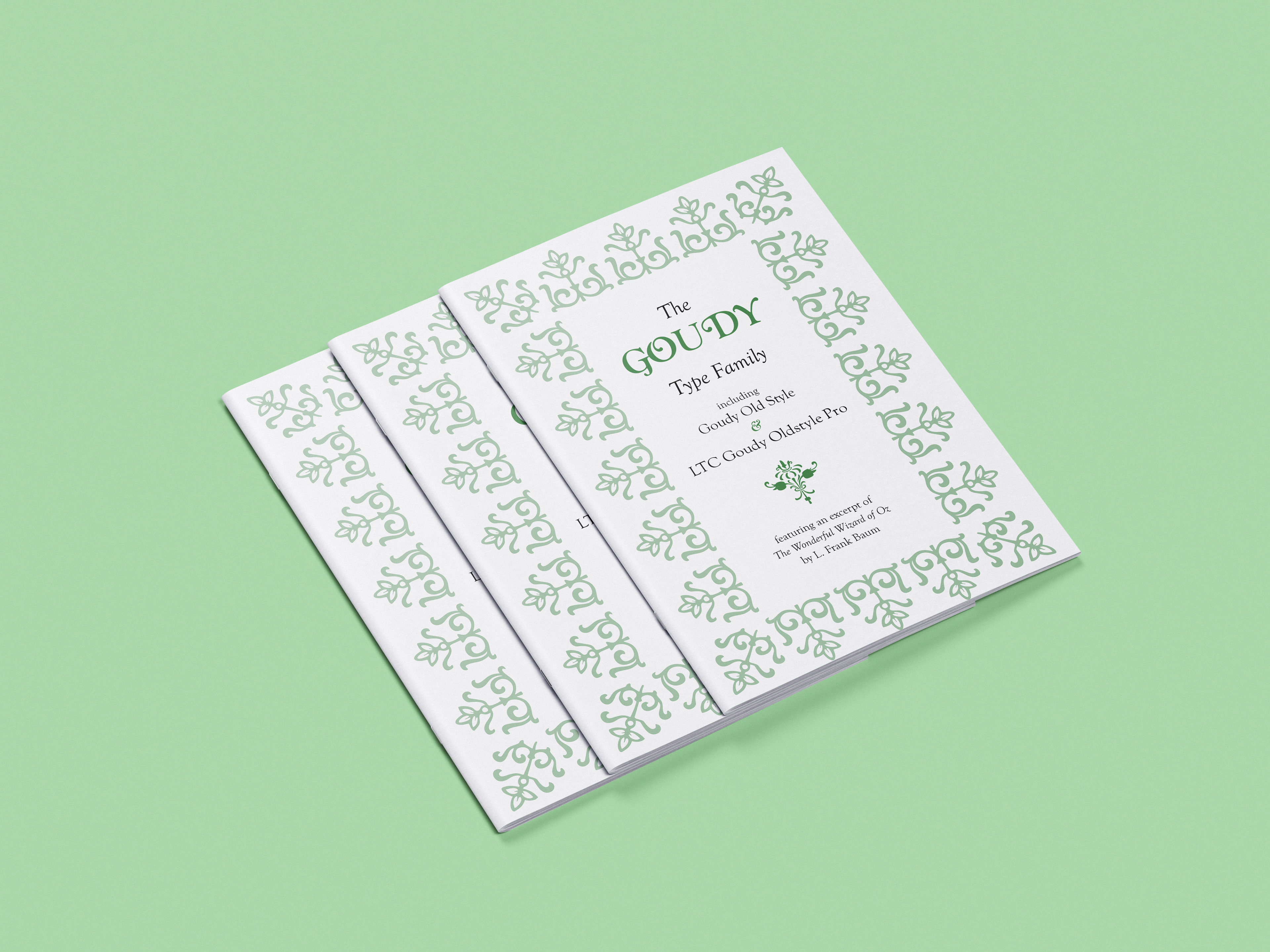
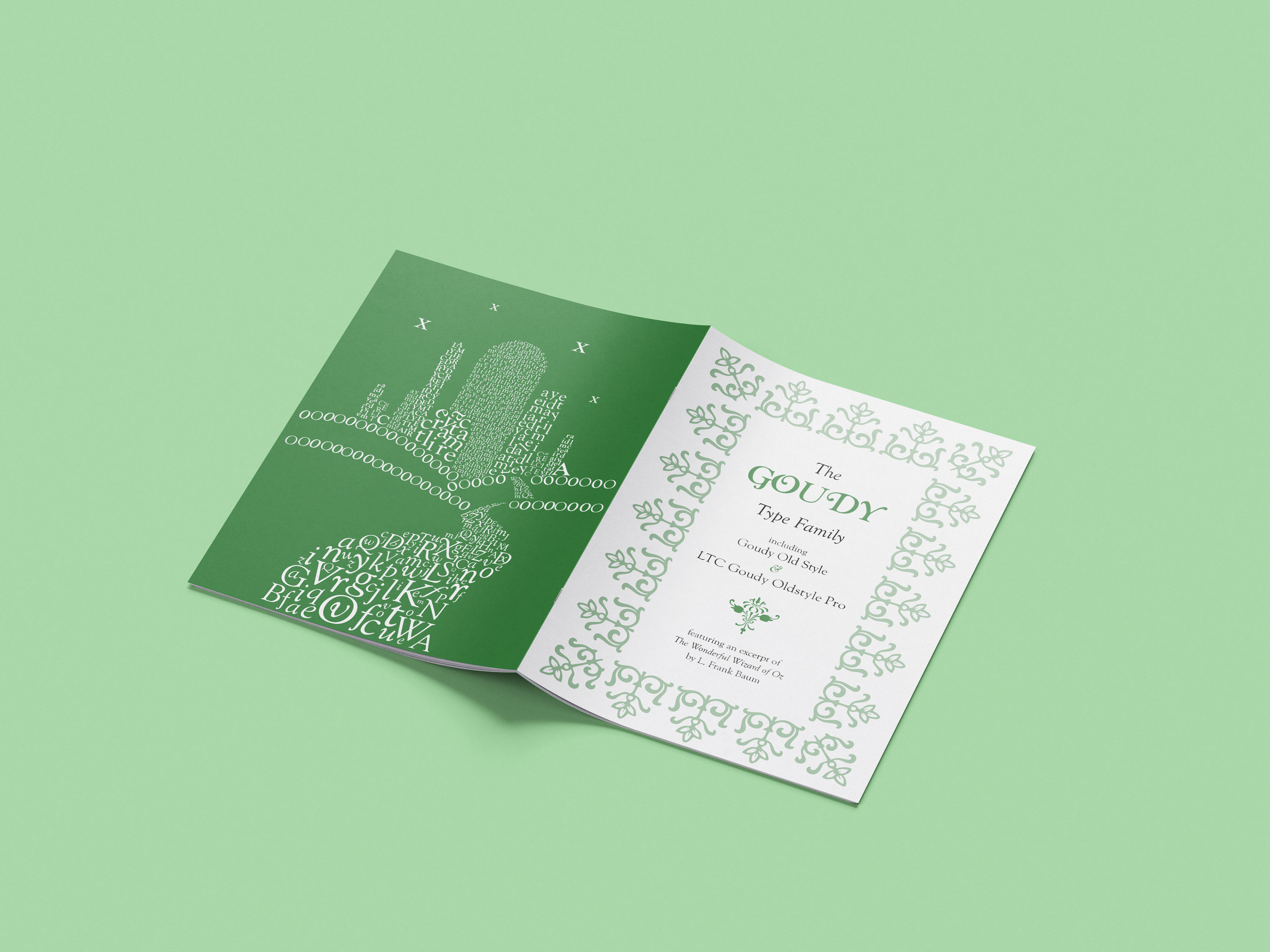
Front and back of type specimen brochure.
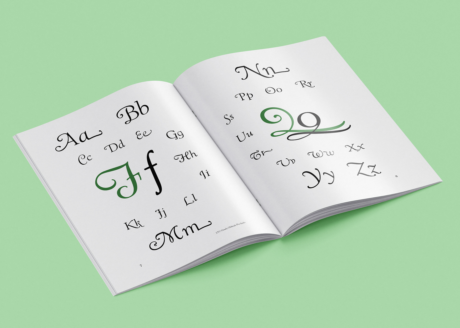
Sample interior of LTC Goudy Oldstyle Pro. Note the Q's swooping tail.

Sample of novel excerpt featured within the brochure.
Although typography is a key vehicle in graphic design, I hadn’t done much research into what goes into creating a typeface or how typefaces evolve during their digital transition. This brochure allowed me to gain a greater appreciation of this process, as well as experiment with the beauty and artistic value typography contains. I chose to spotlight the Goudy Type Family for its sweeping curvatures and crisp elegance in both standard print and cursive-adjacent forms. By using it for The Wonderful Wizard of Oz, Goudy shines as it was meant to, intertwining 1920’s literature with 1920’s type.
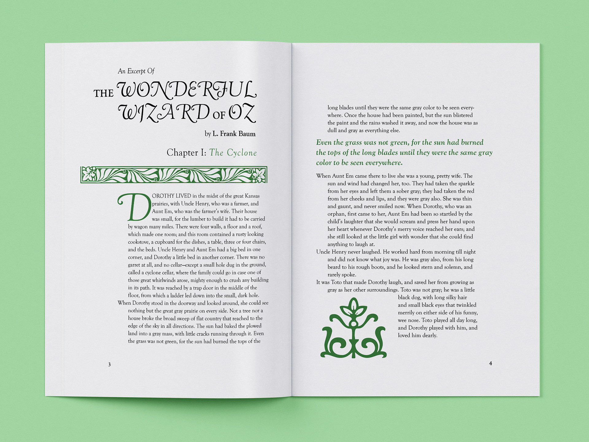
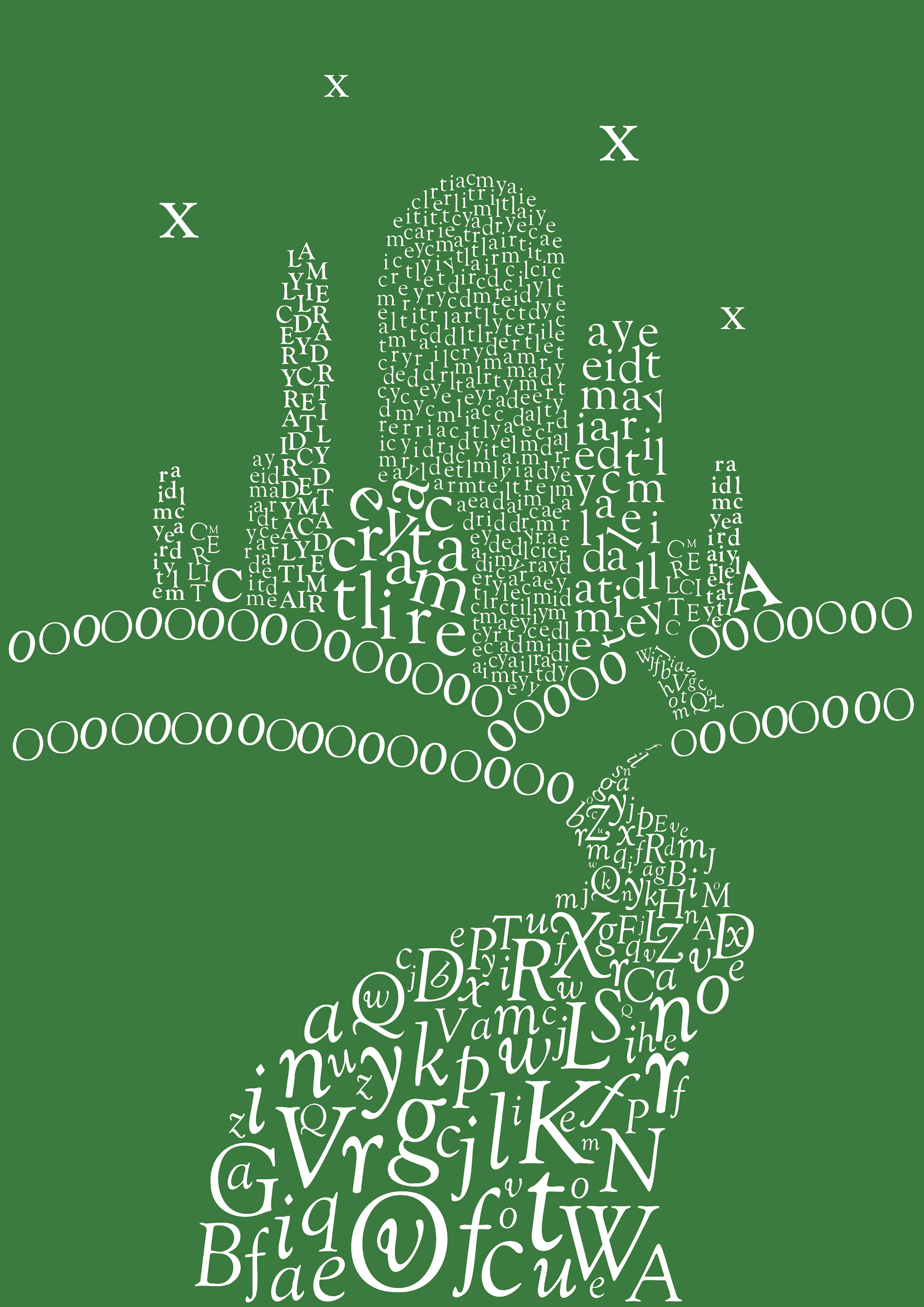
The whole first chapter of The Wonderful Wizard of Oz was used to show how Goudy could be both type and decoration.
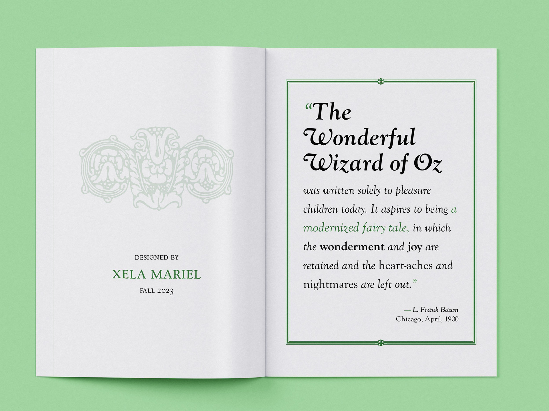
Opening pages of brochure, featuring a quote by Baum.
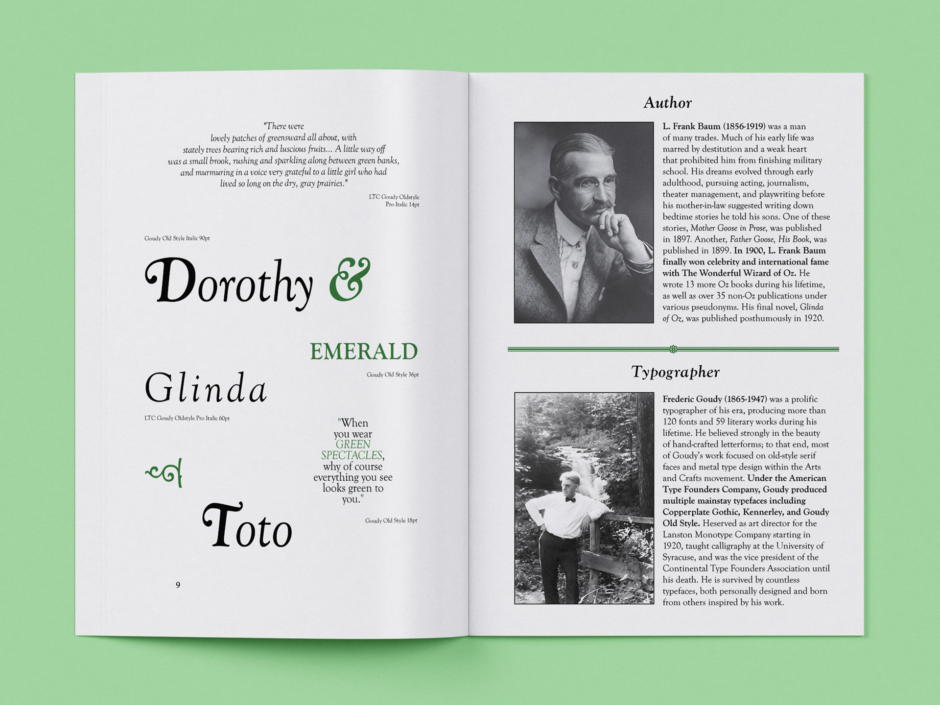
Interior spread of type samples and autobiographies on Baum and Goudy.
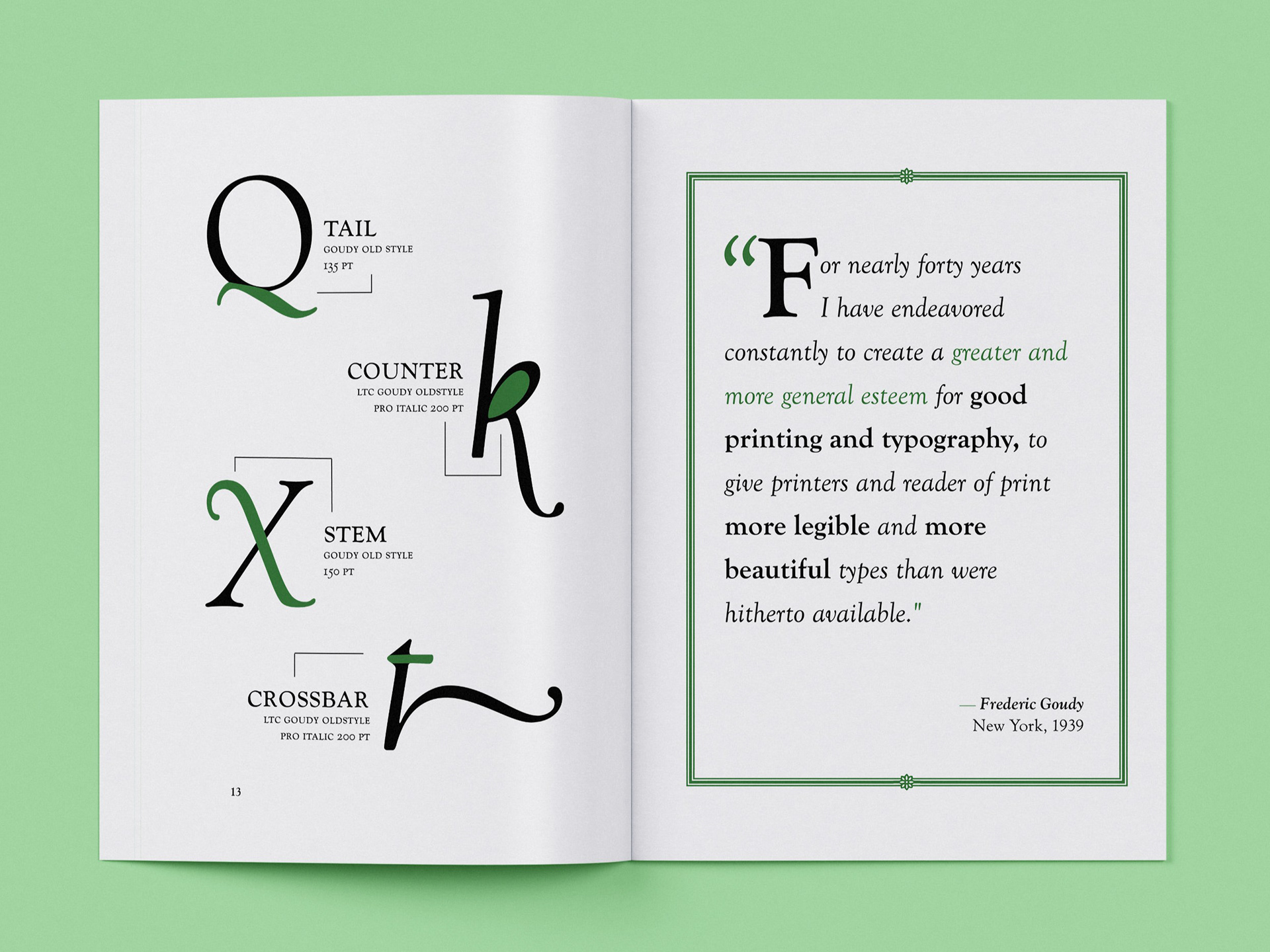
Closing pages of brochure, featuring letter anatomy and a quote by Goudy.
Two forms of Goudy are used: Goudy Old Style, which is a digitization of Goudy’s original typeface; and LTC Goudy Oldstyle Pro, which elaborates on Goudy’s work and uses his stylized renditions as alternative letterforms. Elaborate ornaments, also created by Goudy, book-end the brochure; emerald green, taken from Oz’s Emerald City, is strategically used to bring hierarchy and variety to an otherwise monochromatic piece.
Both literature layout and type specimen layout echo Goudy’s original type specimen books, which were studied for the creation of this composition. The brochure ends with type as image, using both typefaces to construct the Emerald City in a vibrant finishing display.
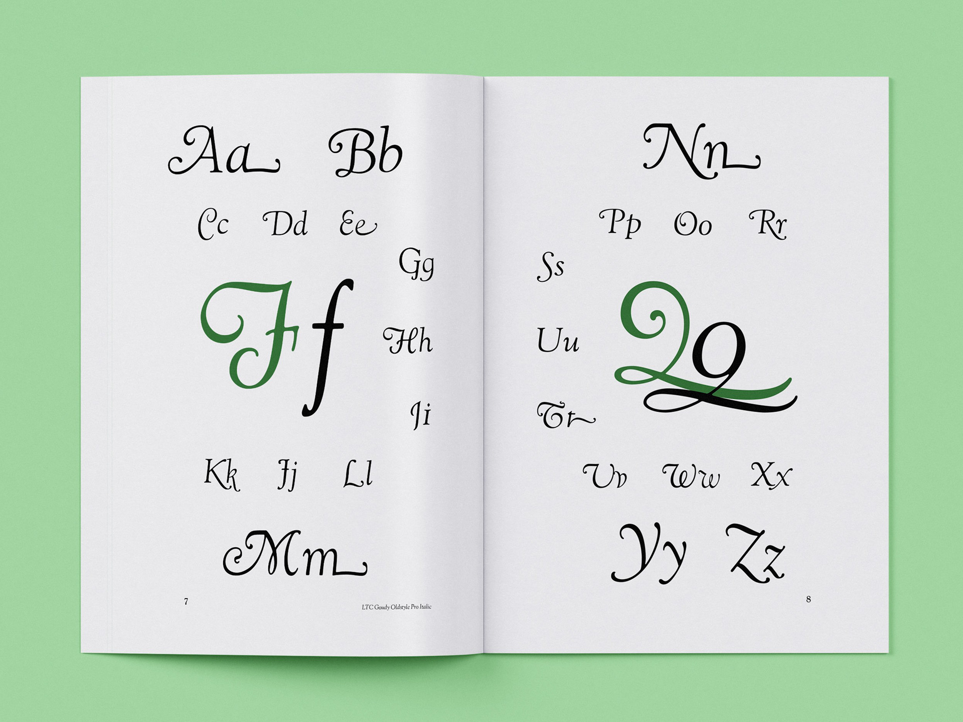
LTC Goudy Oldstyle Pro Italic.
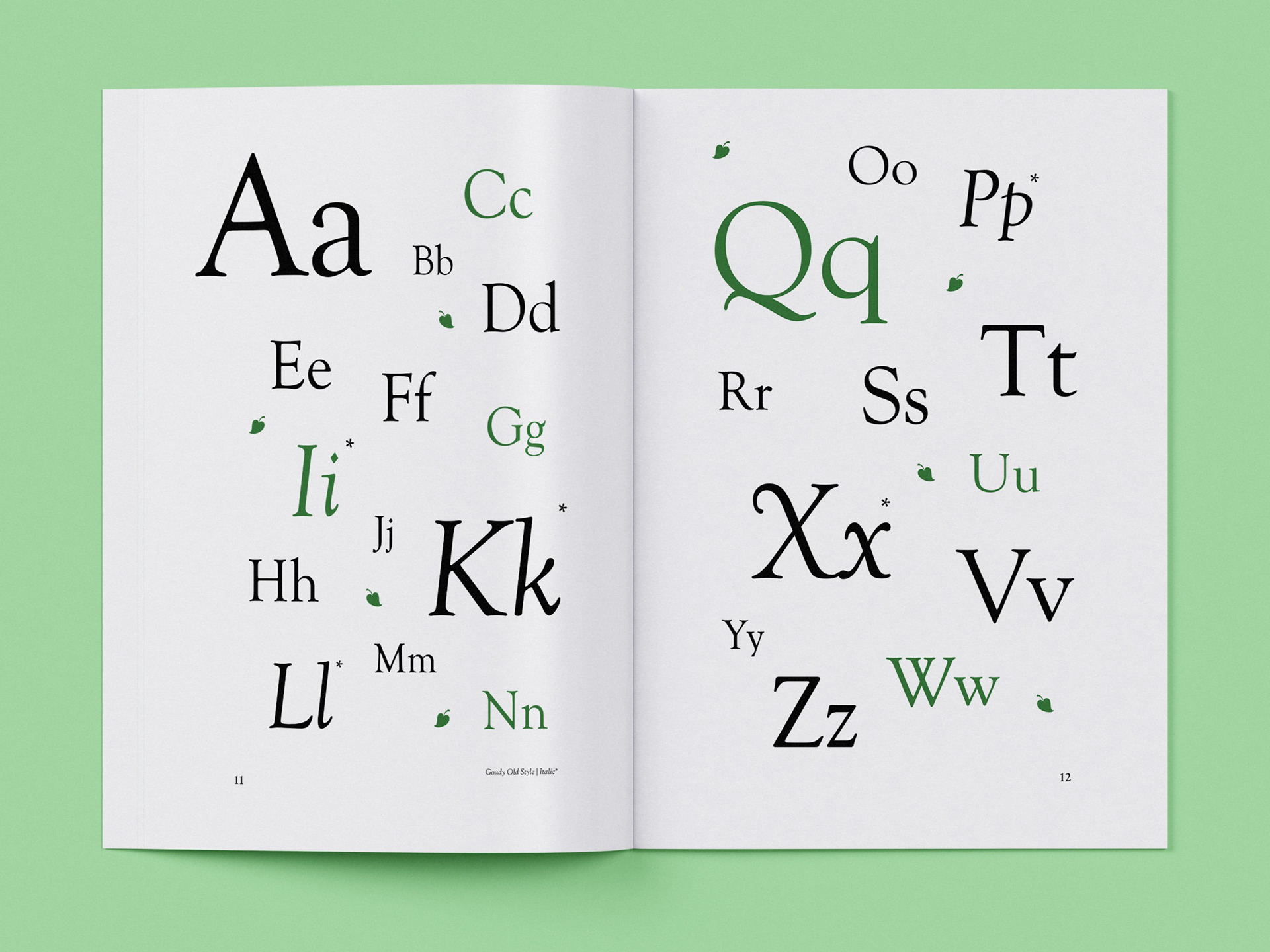
Goudy Old Style Regular and Italic.
Goudy created several versions of his ornaments with the intent of them framing titles in a refined display.
A visual walk-through of the completed type specimen brochure.