

MiraCosta College's Dance & Theatre Department commissioned an advertising campaign for their biannual showcase, Dance Reflections.
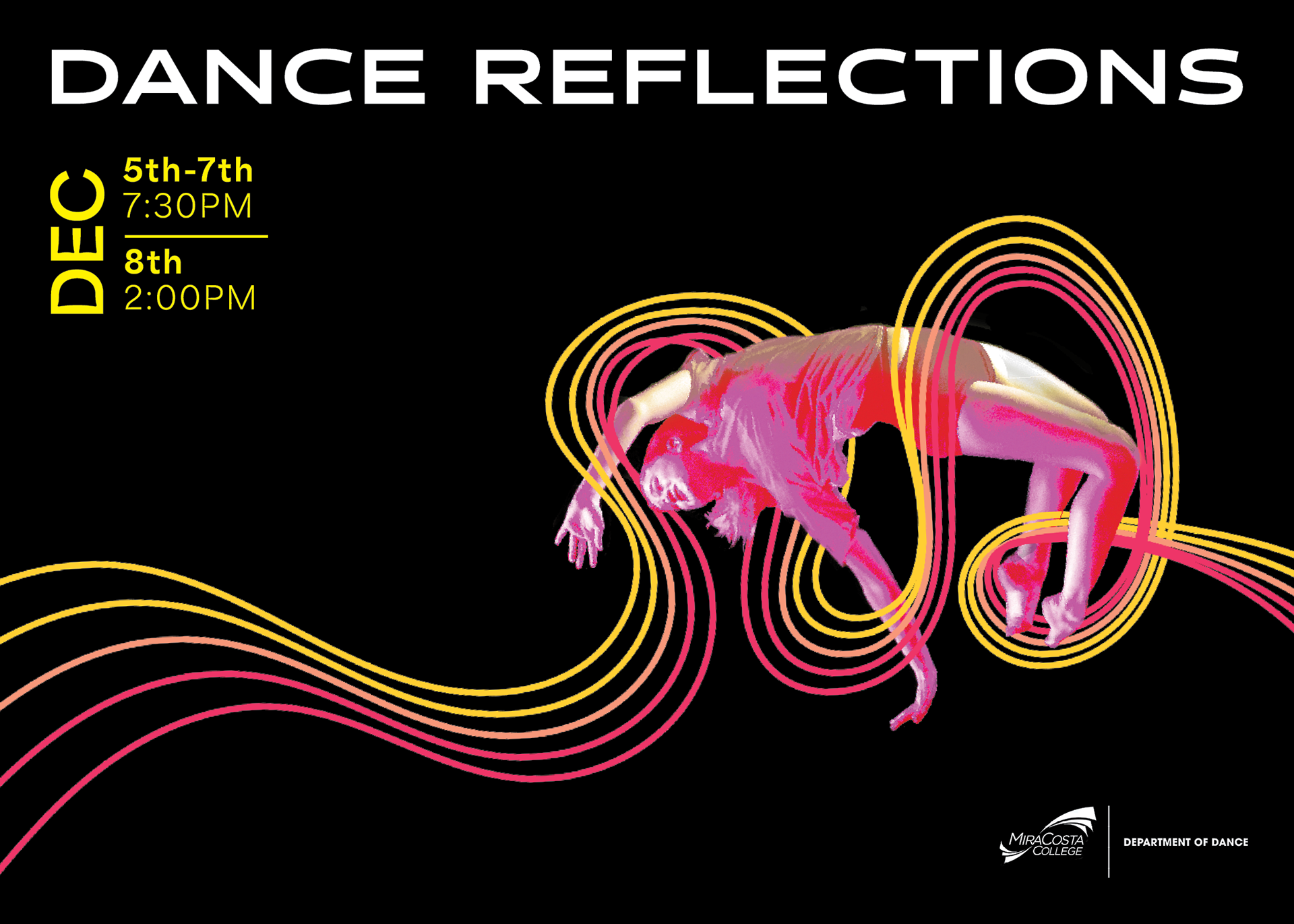
The goal for each iteration of Dance Reflections is to create a campaign that celebrates dance as a dynamic medium of expression. The human body serves as the art display; thus, each campaign should depict movement and avoid generating any one particular genre. The campaign is also meant to stand out amongst other displays around campus and in the city of Oceanside. This time, the client wished for something contemporary, bold, and minimalist.
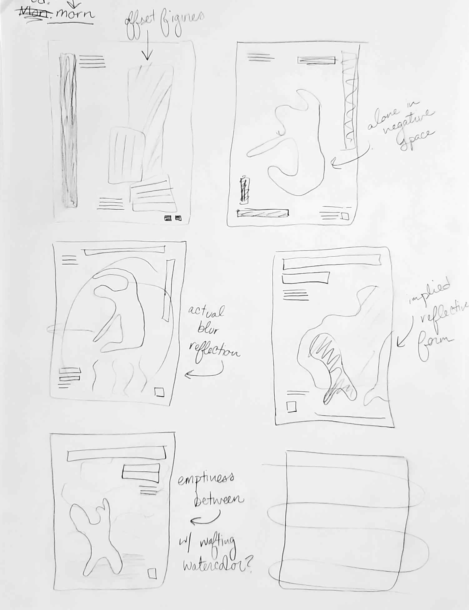
Initial sketches for poster design.
Initial digitization of the chosen sketch.
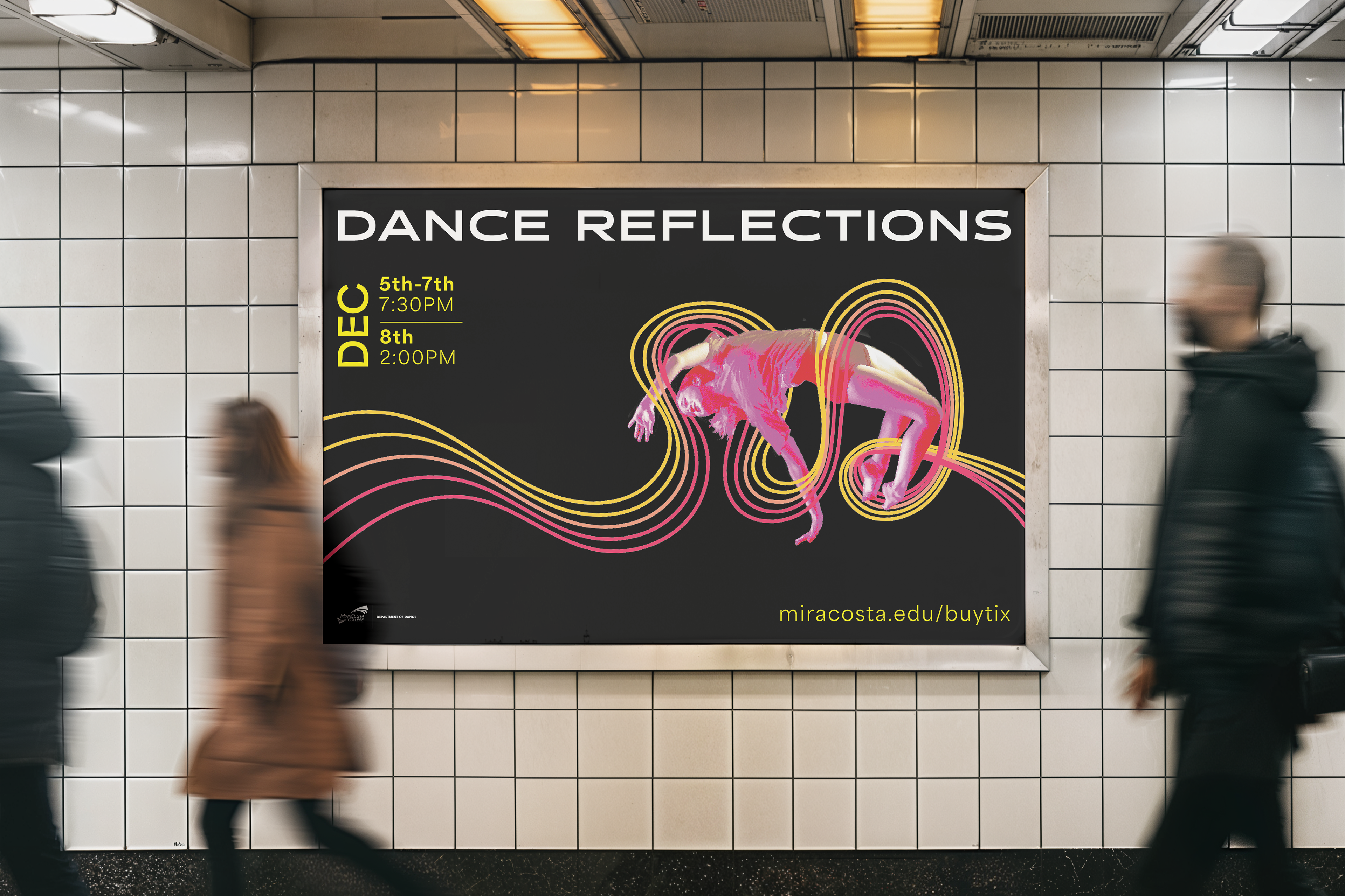
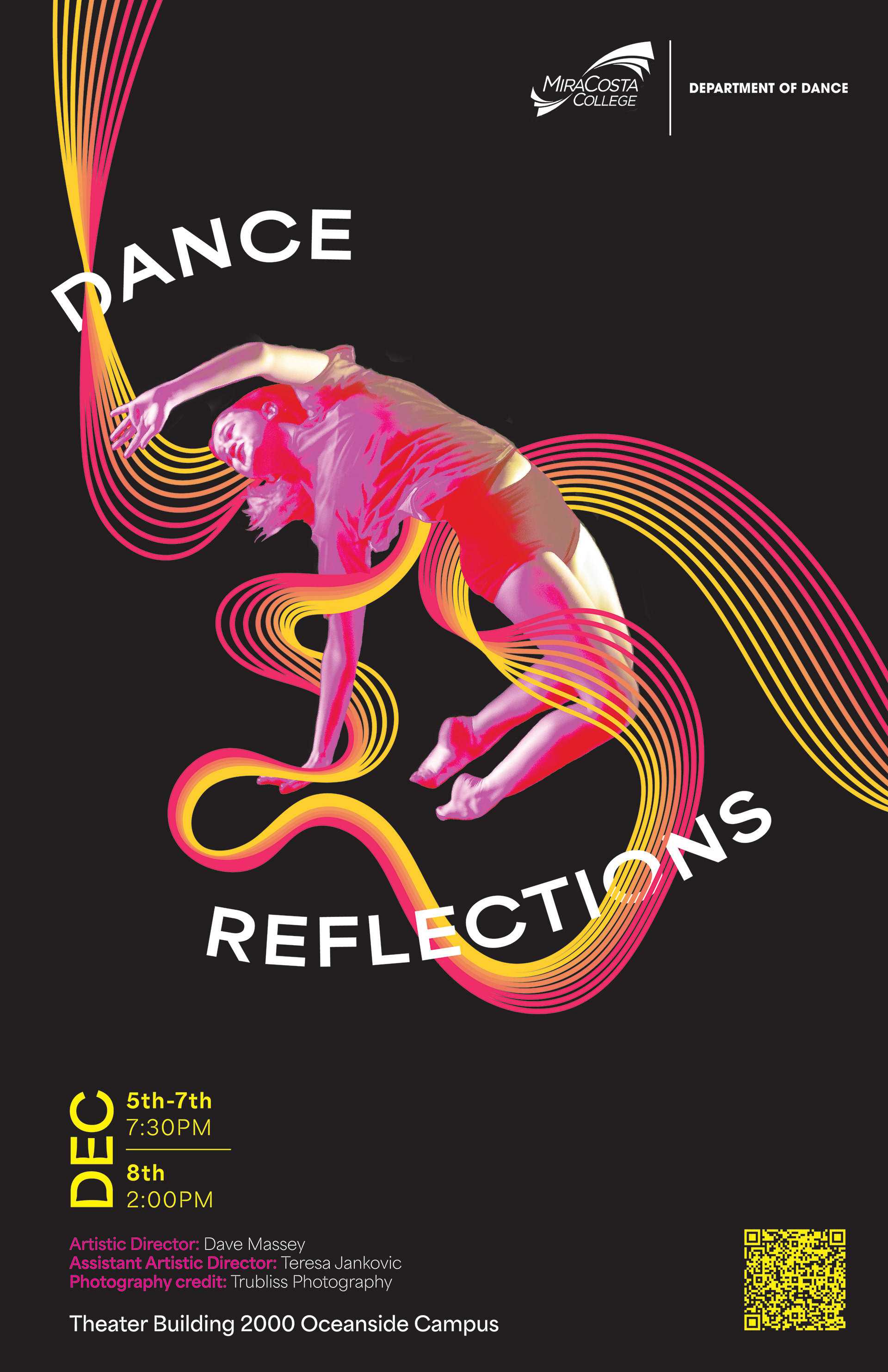
For this season, I chose to emulate the stage and create a “window” into the performance. Most of the image is black—akin to a stage at the beginning of a dance—that allows emphasis on a singular dancer in the center. The client had previously preferred pink, so I used this knowledge as a springboard to incorporate other warm colors. My ultimate goal was to emulate contemporary, minimalist design with dynamic energy through strategic use of neon typography and sinuous line-work that echoes and twists around the dancer’s form.
Front side of postcard mailer.
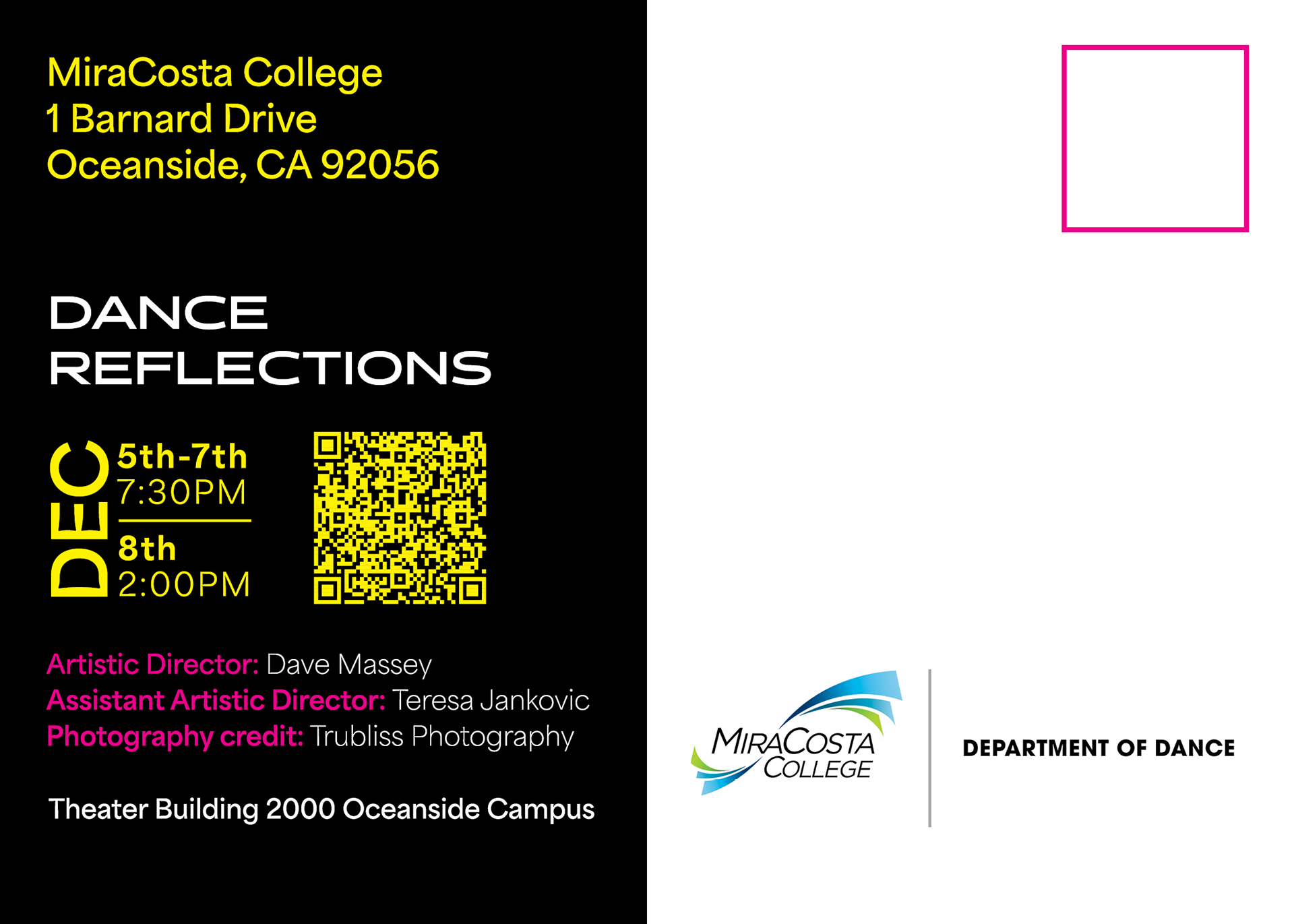
Back side of postcard mailer with room for address.
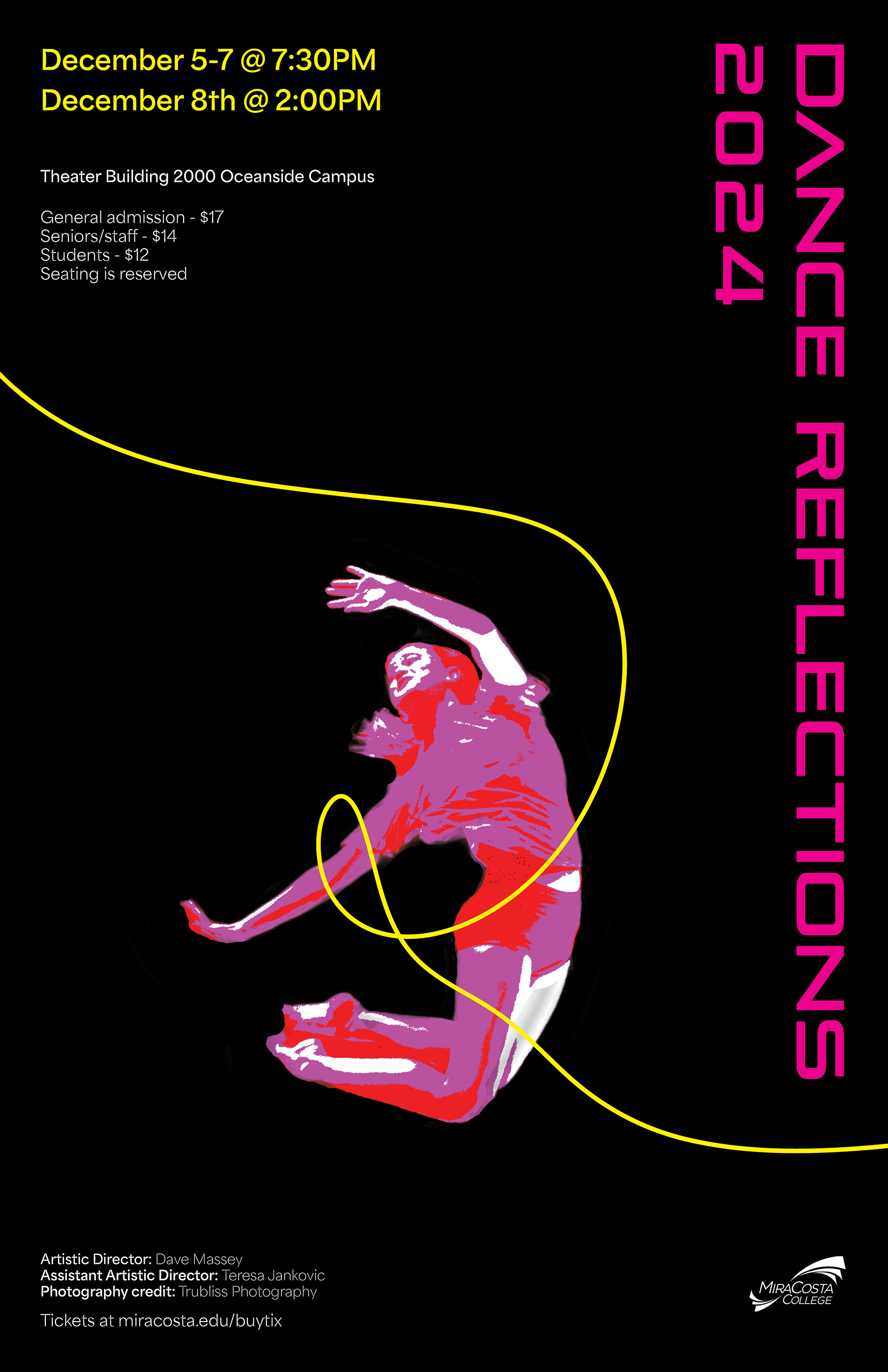
Each deliverable of this project (postcard, poster, and social media) utilizes the dancer in a different manner, allowing for a variety of interactions between physical and digital form. I am used to working with shapes, but specifically focusing on photo manipulation and line-work was a new skill I developed with this project.
It wasn’t always straightforward—I had to experiment with how digital systems interact and respond to minute changes in form—but I feel like a stronger designer because of it. Furthermore, since Dance Reflections is a biannual showcase I’d designed for before, this project also doubled as a benchmark for my graphic design capabilities. I am proud of both iterations I designed, but I especially enjoy Reflections 2024 for its representation of personal and professional growth.
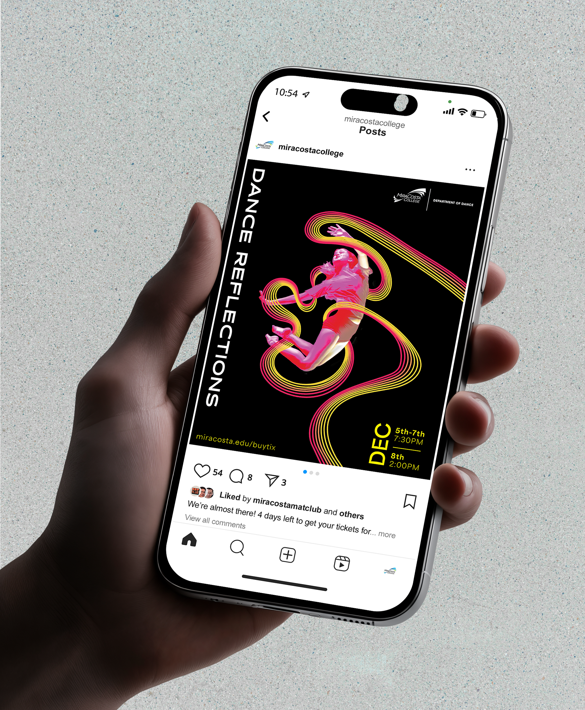
Instagram post formatting.
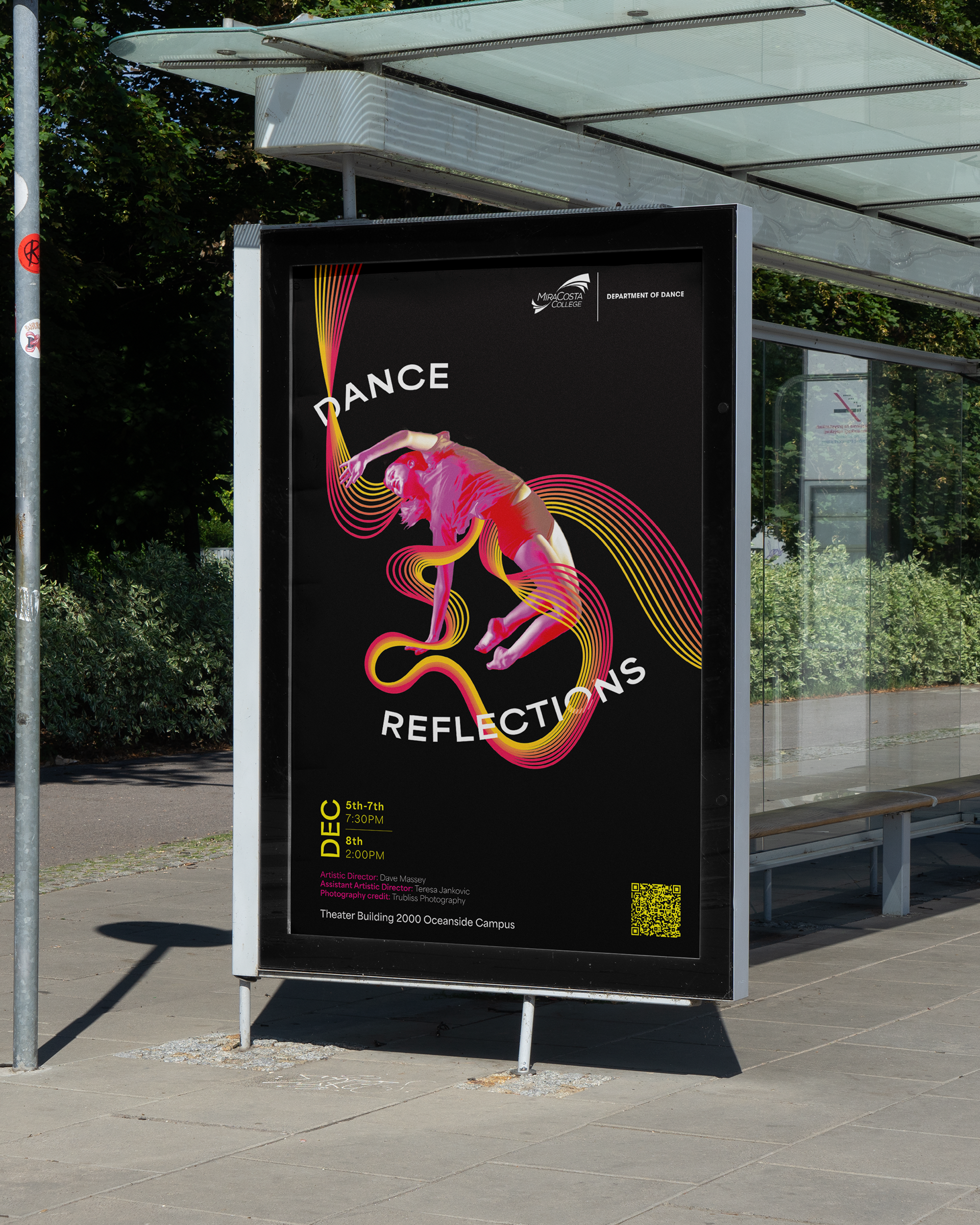
The final poster, contextualized.