36 Days of Type was an annual open project that invites illustrators and designers to explore the forms of the Latin alphabet and numbers 0-9. Artists are challenged to design a letter or number each day and post them to social media. The culmination of this work is 36 glyphs that can follow a singular theme or explore different mediums of inspiration.
I created my own original typeface using personal inspiration and design tools at hand. A single theme applied to all 36 characters: the modernization and fusion of Mayan and Aztec glyphs.
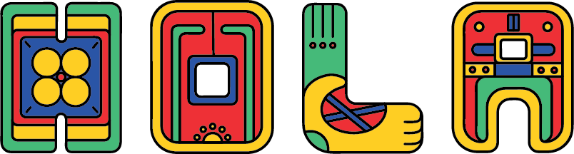
The first four characters sketched in my exploration.
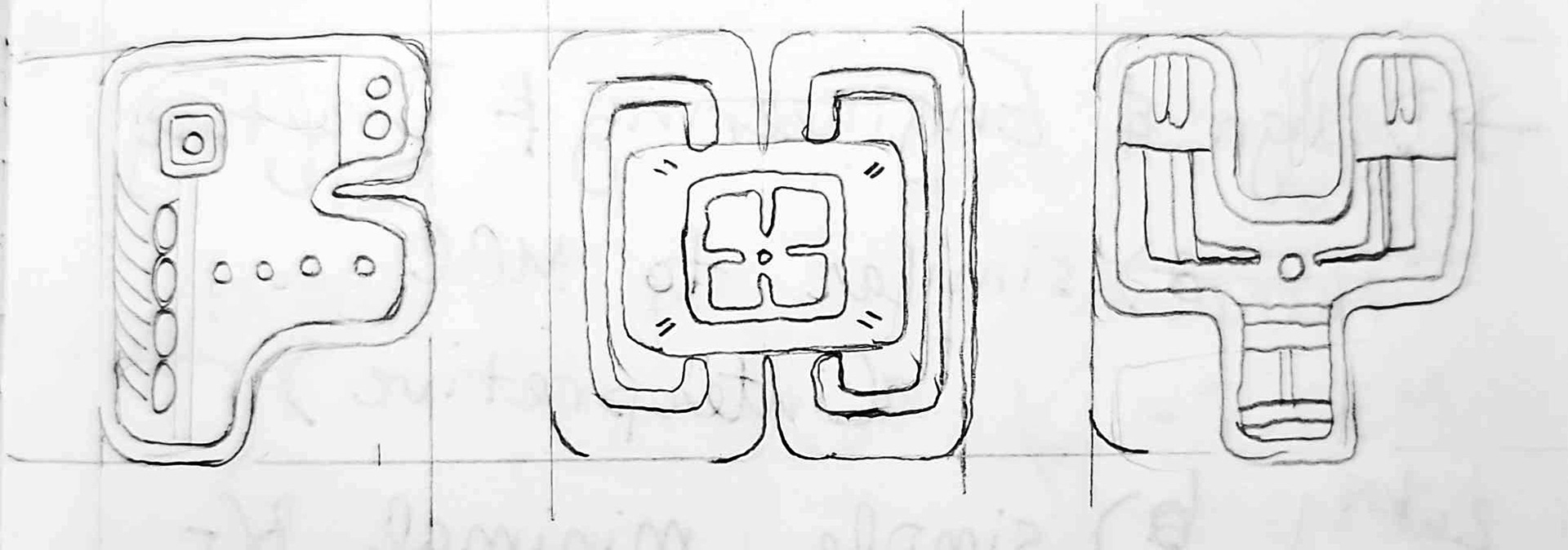
Further explorations. The center of the H is the glyph for sun; the F, intentionally designed to echo a horse.
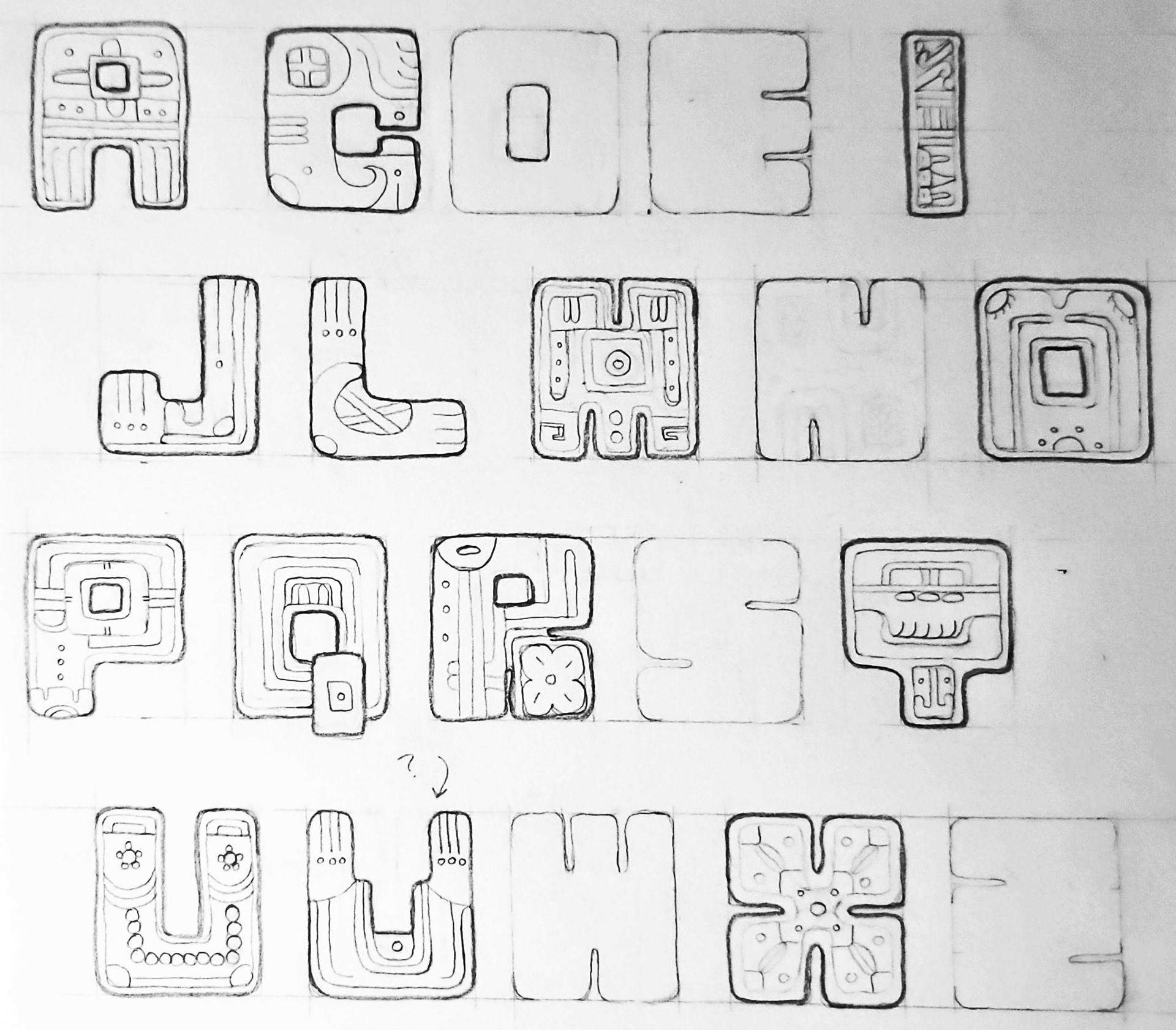
As I explored further, I did my best to follow exact measurements while allowing room for decorative variety.
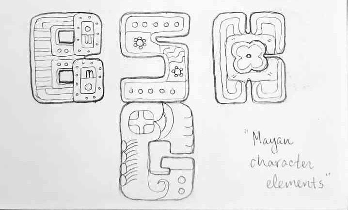
As I sketched, I examined historical texts and online museum collections to emulate Aztec and Mayan motifs. Certain letters, like T, are created using transformed hieroglyphs in their entirety. Every letter is roughly the same width and height; every number, slightly thinner. Counters, legs, and bowls were measured with by-hand with a ruler to create a system of “sameness” across the 36 characters; in many letters, they are identical.
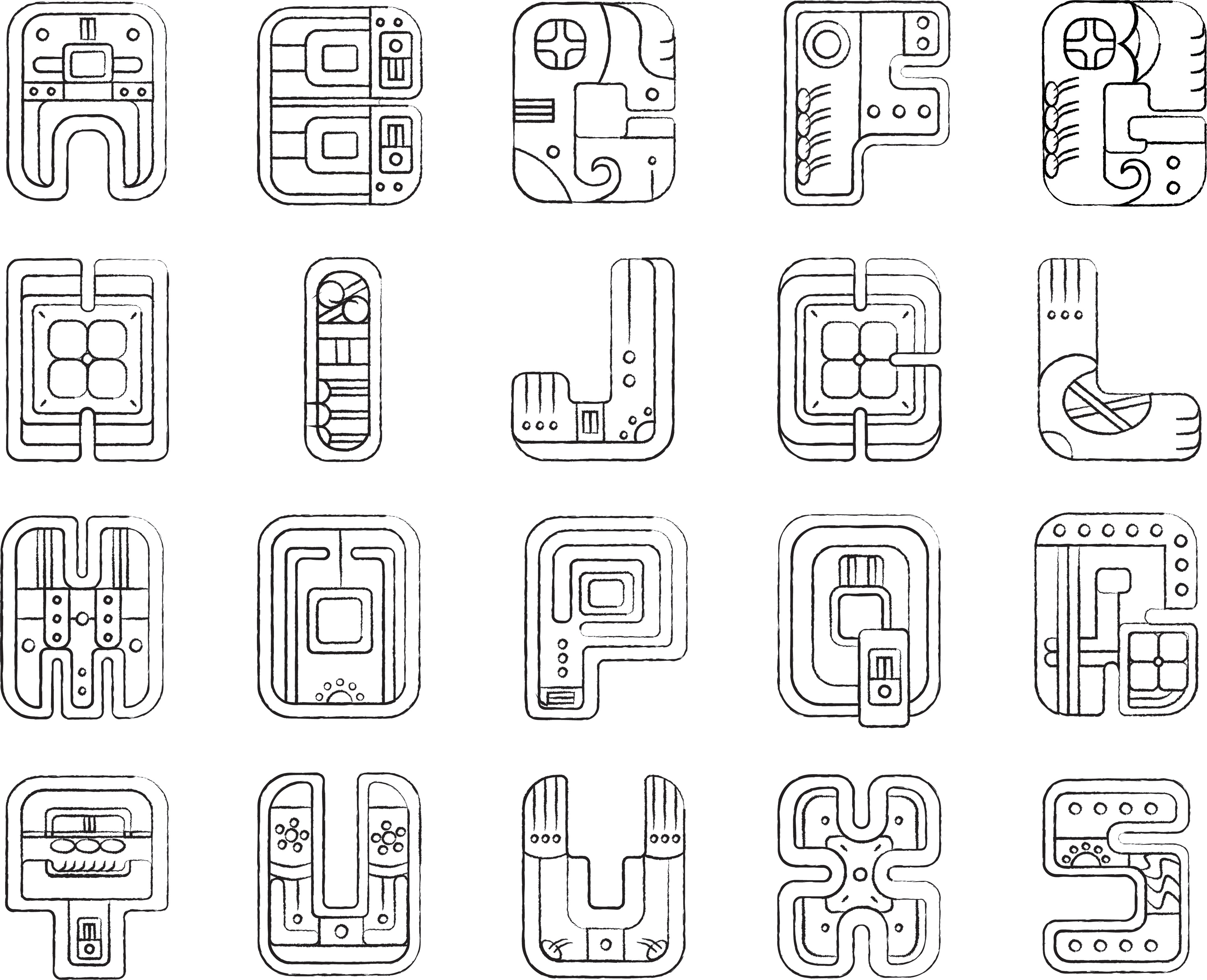
The initial round of digitized characters.
Once I finished sketching, these drawings became my references for digitization. Every character is made with standard Illustrator techniques. After constructing the base glyphs, I colored them with the traditional Mayan palette (red, goldenrod, jade green, blue, and white), placing less emphasis on blue and white since they were traditionally accents. As I colored and finalized each character, I cleaned up leftover paths and streamlined layer groups for future use.
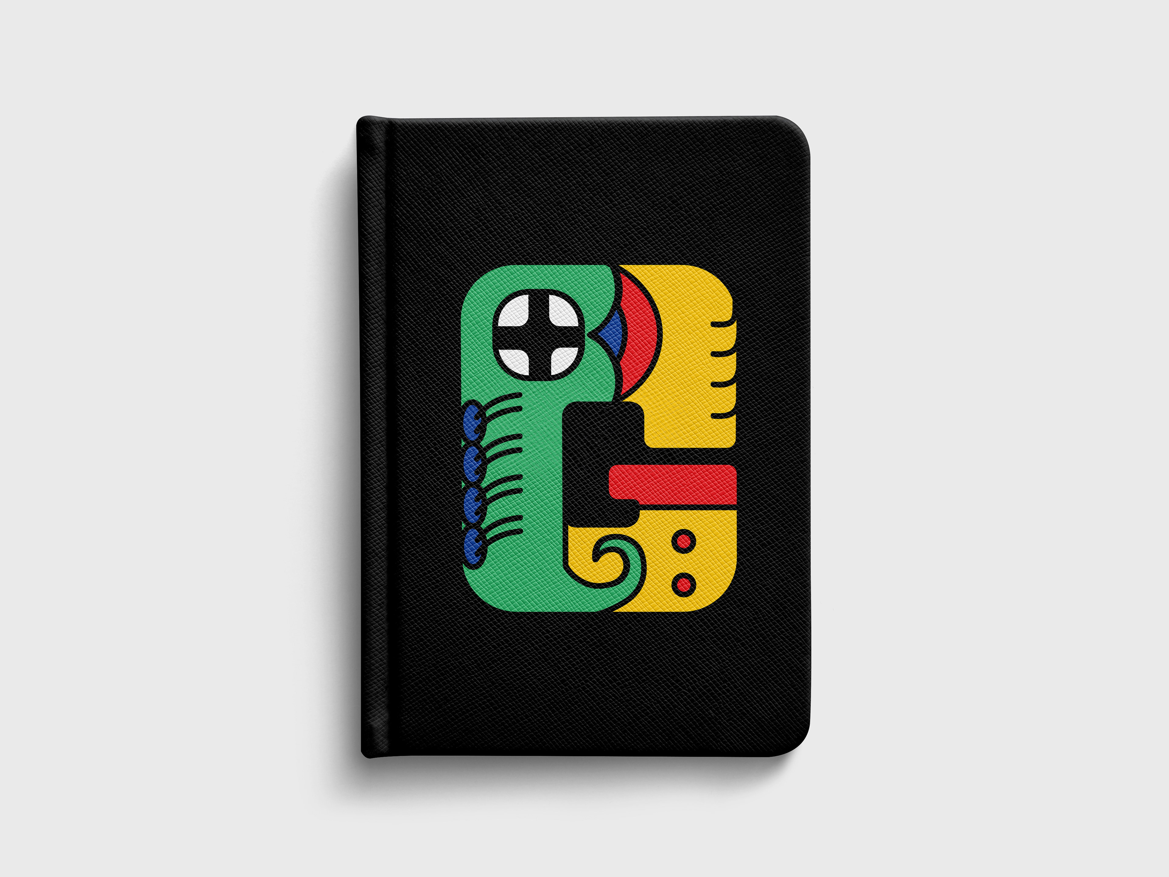
A play-by-play of creating my favorite glyph, the letter G.
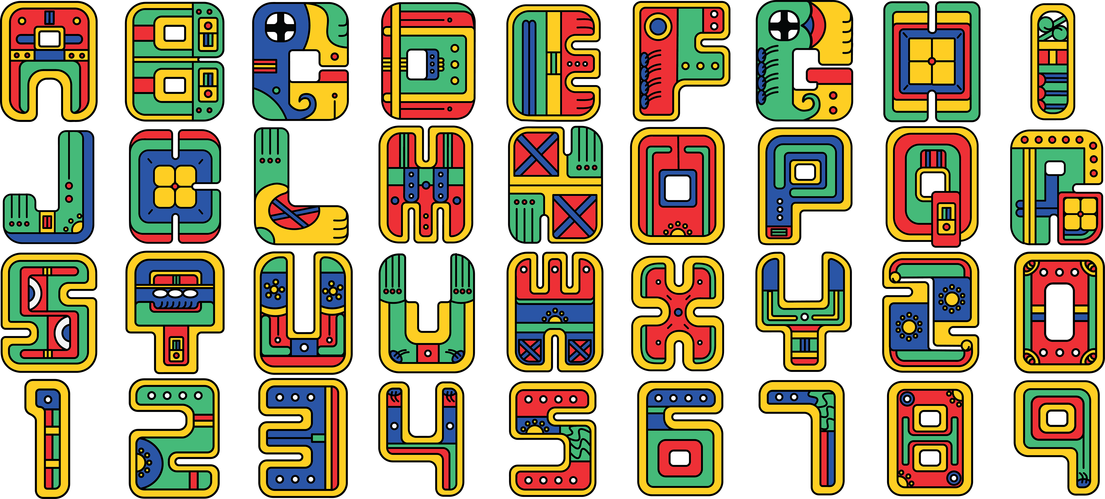
The final 36 characters.
This concept was not the one I originally chose. I went through several rounds of exploration sketches and digitization before restarting the project entirely. Since the original hieroglyphs and illustrations were geometric and stylized with a simple color palette, the Mayan/Aztec fusion theme was straightforward to digitally replicate.
Creating this typeface was also an instinctual choice. As someone who’s name and cultural history ties closely with historic Latin America, I have always had a fascination with Mayan culture and folktales. This project allowed me to turn a personal interest into design, and explore further into the history that quite literally made me as I am today.
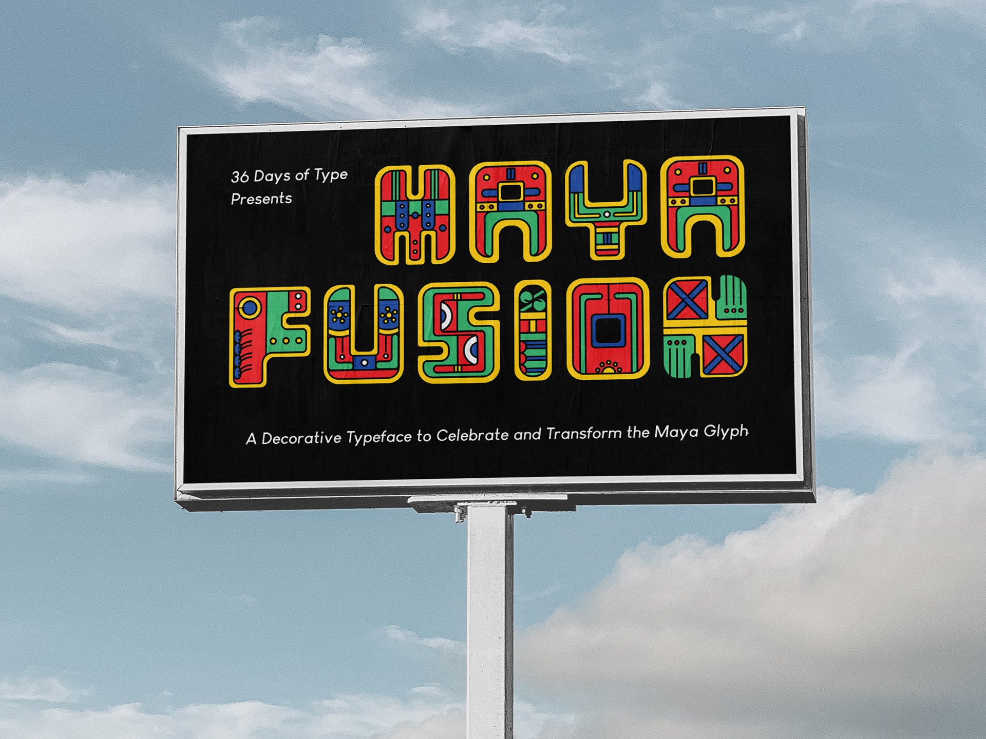
Maya Fusion is a great typeface for large, eye-catching displays.
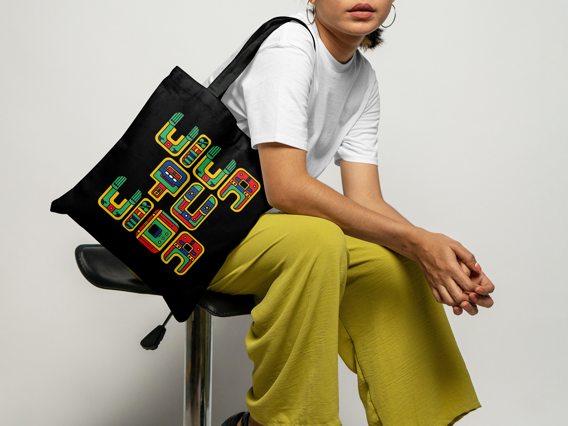
Maya Fusion also makes for a great statement piece.
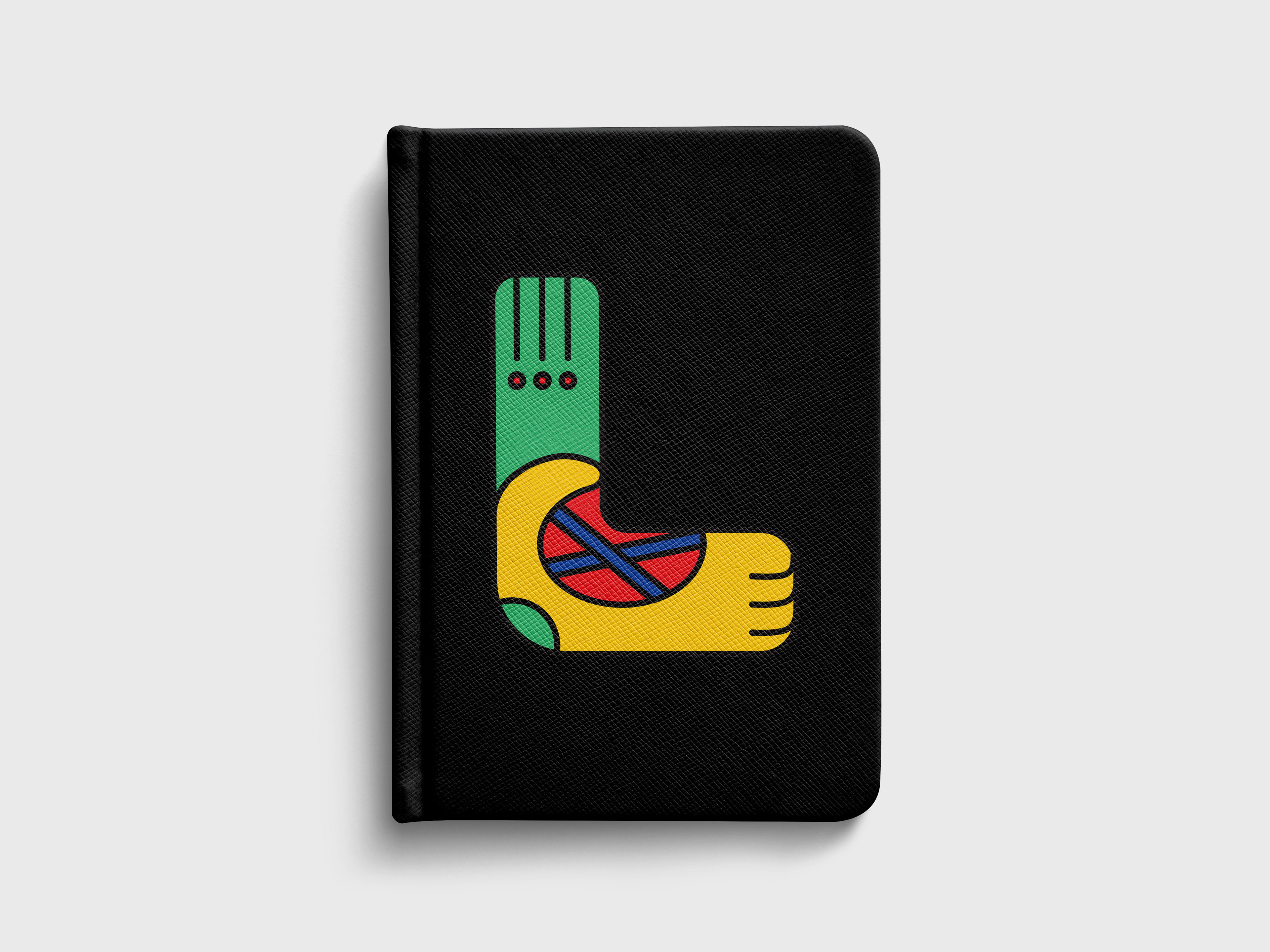
A notebook personalized with the letter L.
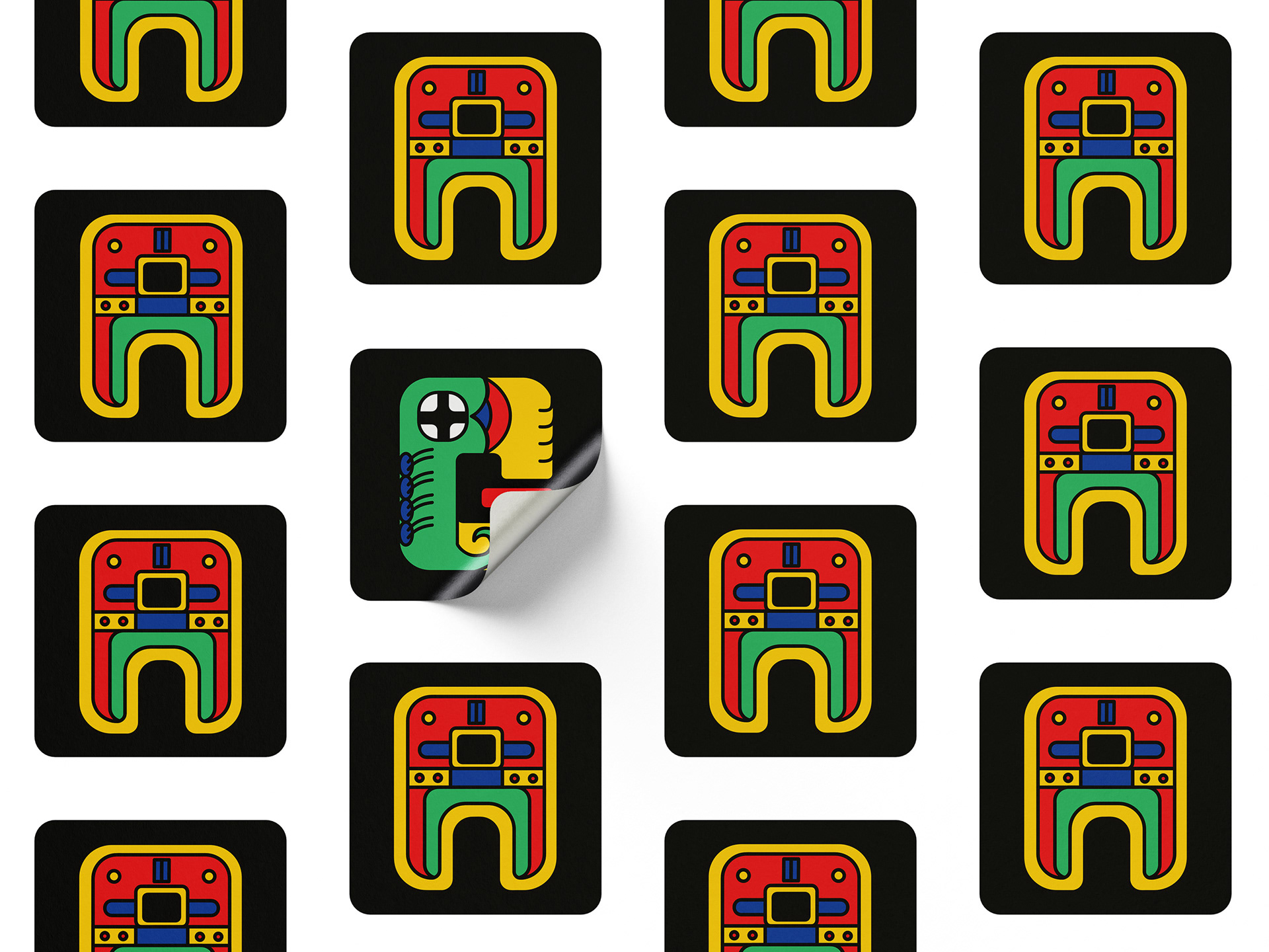
Maya Fusion as character stickers.